
April 22, 2025
When I think about planning a webshop update, my brain takes off…
-Photos
-Photo editing/resizing
-Taking weights and measurements
-Estimating shipping costs
-Writing a description for each item
-Creating the listing in the website
-Logistical and web layout work
-Composing an email
-Double checking each listing for accuracy
After Sales:
-Packing orders
-Weighing/measuring packages
-Creating shipping labels
-Writing thank you notes
-Trips to the post office
-Recordkeeping of each sale, mileage, shipping expenses, transaction fees
This is the basic process…not including the actual making of each piece, which has its own multi-step process!
As you can sense, it’s quite time consuming, especially given that each piece is one of a kind. While I’d love to be able to keep work available in the shop consistently, it isn’t feasible at this point. Yet it can be very satisfying to be able to send pieces out to new homes that are accepted so lovingly. It gives people out of state who follow my work a chance to purchase in an easy manner.
I truly love packing up orders and writing thank you notes for each customer.
When I do a webshop update, I’d like it to be successful-meaning customers are excited and happy with what they see and buy, and that it also makes sense for my business given the time and effort I put into it.
Unless something drastically changes, there will be only ONE webshop sale this year, and I will choose a time that makes most sense given the feedback I receive and my schedule. Stay tuned! Thank you!
November 16, 2024
New Glazes!
I am excited to introduce the addition of two new glazes to the studio palette.
Upon first glance, they can appear much like the two main colors I’ve been using for many years. And yes, they are. In regards to their materials, the amount of colorants vary in minuscule amounts, so it is no wonder they look so similar. However, upon a closer look and side by side comparison, there is a marked difference.
Without further ado, here they are!
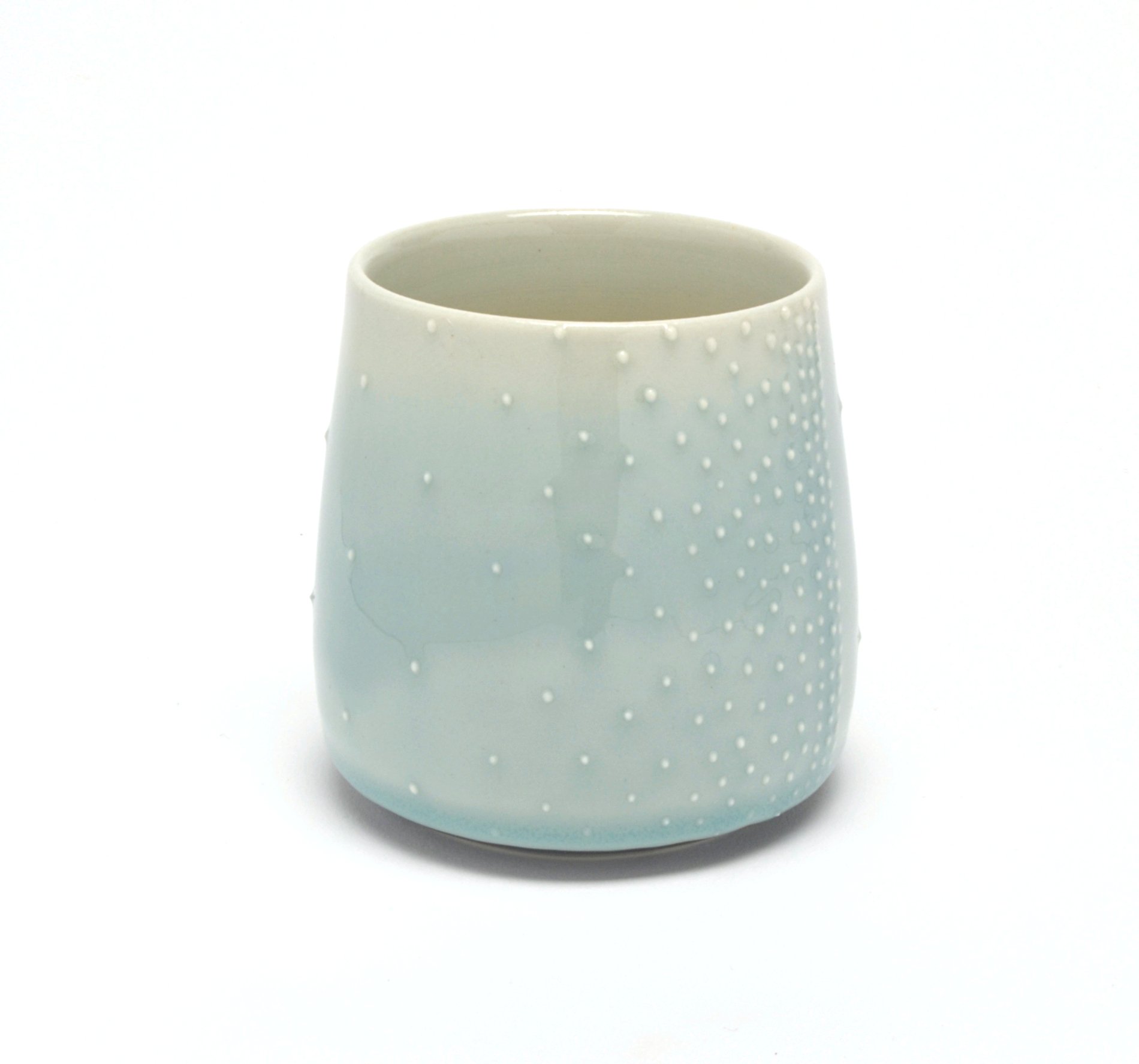
Cup in new BLUE:
Cup in new GREEN:

For now, they will simply be called “green” and “blue”. I know, very original. If you have a name suggestion, send it my way! I’ll be contemplating this winter…I know we all perceive color differently, and that is a topic for another day. Yet in my eyes, these are a more true blue and green than what I’ve been using previously.
Take a look at the tiles below comparing the new glazes (TOP) with the previous glazes (BOTTOM).
BLUE:
The new BLUE is on top.
On the bottom, the previous glaze, which has been referred to as celadon, light blue, bluegreen, or pale blue! It’s been hard to pin down.

GREEN:
The new GREEN is on top.
On the bottom, the previous glaze, which has been referred to as spring green, light green, or pale green.

Why does it look like there are four colors, not two, in each photo?
Most of the glazes I use are sensitive to thickness because of their translucent nature. In the tiles, you’ll see on the left a “regular” application, and on the right a “thick” application. The appearance can vary dramatically depending on thickness. I may choose to apply it differently depending on the form. However, there are many factors that affect thickness, and I’ll revisit this topic in a future writing.
I simply want to show some of the range of intensity one glaze is capable of.
More on color and glazes to come! For now, I hope you enjoy these additions to my glaze offerings.
P.S. I’ll likely continue to use the previous iterations until the glaze buckets are empty, and at that point, decide if they’ll be retired. One can only have so many buckets in the studio!